Friday, 18 January 2013
BEST DESIGN TIPS TO START A MAGAZINE
Do you like this story?
BE CONSISTENT
Even
if your choice is to break every rule, there has to be a logic behind
your choices as a designer. Consistency is not about using similar fonts
or layouts throughout the publication; it is all about creating your
own personal logic and following it.
In
fact, today´s designer´s are creating their own fonts to match the
tone, look or topic of a page, so, as long as you have a clue, the
magazine´s readers will do as well.
MIND YOUR AUDIENCE
The
look of a magazine will make it appealing to a certain audience and
unappealing to another. When people often think that it is the content
that defines the audience and the design not so much, but people see
before they stop to read. If your magazine looks like something that
wouldn´t interest them, people will look the other way. It is ALL about
first impressions, which brings us to the cover.
DOMINATE THE COVER
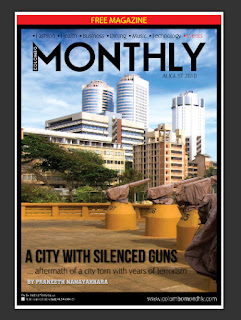
The
cover is the key element of magazine marketing. This is where most of
your designing efforts should go. Your cover design has to be aligned
with the magazine´s vision, and it has to use a combination of (short)
text and images that is striking, smashing, beautiful, modern, shocking,
groundbreaking; in short, it has to be DRAMATIC.
Here
is a good example of using a combination of text and images that create
great drama. Of course, you don´t need war or danger to create drama.
Drama can be in a face and a title, drama can be in a combination of a
texture and a font and a certain topic.
Your
goal is to have people not being able to look away from your magazine
cover. In terms of photography, you should always go for photos that
don´t only look good but also tell a story. If it tells only part of an
exciting story, people will be compelled to pick up the magazine, in
order to get the rest of that story.
MASTER THE CONTENT-DESIGN DYNAMIC
If
you get an article of a million words, and you are asked to create a
layout, without any chance of reducing the text, chances are, the text
will look crammed into the page. Working closely with the editors means
negotiating word counts and spaces as you go. Today, the trend is to
leave a lot of white space around text; it creates a cleaner look, and
it makes articles easier to read.
In
order to make the design of the inside pages of your startup magazine
flow, you need to master the dynamic between design and content.
DON¨T UNDERESTIMATE PRINTING
Your
most fabulous design efforts will be lost, unless the people at
there choice knows what they are doing. When you design professionally,
every nuance in color shades, every variation in paper counts.
Your
safest bet is to advice your employer to hire only the best printing
company and then work closely with them during the mockup and proofing
phase to ensure optimum quality.
MIND YOUR COLOR SCHEME

The trend today is to use basic colors from the spectrum of light. Basic colors can make a bold statement.
I
love this grayscale example from CHROMATIC magazine. Simple fonts,
simple and perfect composition, text that combines with photo to tell a
story, some headlines that create mystery and might excite your
curiosity, i.e. Lowercase People; all of this elements combine to make a
simple yet powerful cover.
BE CREATIVE
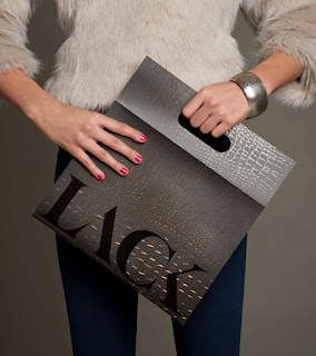
Thinking
outside the box always pays. In the example I am showing you, Hungarian
designer Miklos Kiss thought more like “inside the bag.” This totally
reminded me of Kramer´s idea about a coffee table book that turned into a
coffe table on the TV show Seinfeld. In the case of LACK magazine, the
concept was executed beautifully. The magazine becomes both an objet
d´art with a sleek modern design, and a practical handbag. As a woman, I
can totally appreciate this one.
I´m
not saying that you have to create magazines that transform into
something else; I am only saying that the more you let your imagination
fly, the better.
USE FONTS CREATIVELY
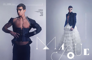
To finish up, an examples of using fonts to your best advantage, also from LACK magazine.
TAKE ADVANTAGE OF GREAT ILLUSTRATION
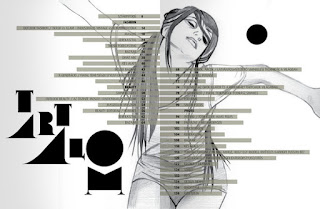
This
is my last example, also from LACK. The composition, the illustration
and the creative use of fonts make for one of the coolest index pages I
have ever seen.
As
you can see, starting a magazine is no piece of cake, but it can also
be one of the most challenging and fulfilling projects a designer can
take on.
"Dont forget to subscribe,join my site for new Games and softwares Updates,and to leave comments!"

This post was written by: Author Name
Author description goes here. Author description goes here. Follow him on Twitter
Subscribe to:
Post Comments (Atom)


0 Responses to “BEST DESIGN TIPS TO START A MAGAZINE”
Post a Comment